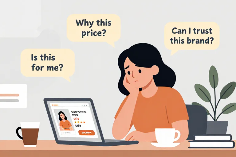
I've seen plenty of website audits that are technically correct.
The page is too long.
The CTA isn't prominent enough.
The headline could be clearer.
The navigation is a little confusing.
The site has too many pop-ups.
The product page should show reviews closer to the purchase area.
None of these observations are necessarily wrong.
The problem is that they often leave me with the same question:
So what made the shopper not buy?
That's a different question from:
“What's wrong with this page?”
And I think that difference matters much more than it first appears.
A Website Audit Usually Starts With the Website
This is the natural way to do it.
You open the homepage.
Then the navigation.
Then a product page.
Then maybe the cart.
You inspect the layout, copy, usability, mobile experience, accessibility, speed, calls to action, forms, and other elements.
You find issues.
You prioritize them.
You write recommendations.
The website becomes the object being analyzed.
That makes perfect sense.
But the shopper doesn't experience a website that way.
They don't open your homepage thinking:
“Let's see how good their information architecture is.”
They arrive because they want something.
And they leave because they haven't decided to continue.
That's a different unit of analysis.
A Shopper Doesn't Experience “A Website”
They experience a sequence of decisions.
Let's say I'm looking for a reading chair.
I land on a brand I've never seen before.
My first thought isn't:
“The hero section has insufficient hierarchy.”
It's:
“Is this the kind of chair I'm looking for?”
Then:
“Does it actually look comfortable?”
Then:
“Why is it this expensive?”
Then:
“Can I trust this company?”
Then:
“Will it fit in my room?”
Then:
“What happens if I don't like it?”
Then maybe:
“I should compare this with another chair.”
These questions can send me all over the website.
And some of them may happen almost instantly.
Others may show up only after I've spent several minutes with the product.
This is why I think a useful ecommerce audit needs to follow the shopper's decision, not just the site's structure.
The Same Page Can Be Fine for One Shopper and Wrong for Another
This becomes obvious once you stop looking at the page in isolation.
Imagine a $240 mattress.
A first-time shopper may care about:
Who is this brand?
What makes this mattress different?
Can I trust the company?
A price-sensitive shopper may care about:
Why is this $240 more than another mattress?
Is the difference actually meaningful?
A comparison shopper may care about:
What does this mattress do that the other three I'm considering don't?
It's the same page.
But there isn't one universal “shopper experience.”
There are different decisions happening on top of the same interface.
That's one of the reasons generic audits can become repetitive.
They see:
Product description could be improved.
The shopper sees:
“I still don't know whether this is for me.”
Those two statements are related, but they are not the same.
The Difference Between an Observation and a Shopper Finding
This distinction is important.
An observation might be:
Shipping information is not visible above the fold.
That's factual.
A traditional audit may then turn it into:
Move shipping information higher on the page.
Maybe that's right.
But a shopper-centered finding asks one more question:
Why does the shopper need that information at this moment?
Suppose the shopper is already interested in the product.
They see the price.
They are considering buying.
Now they ask:
“When would this arrive?”
They can't find the answer without leaving the page.
Now the problem isn't simply:
“Shipping information is too low.”
The actual problem is:
The shopper has reached a purchase decision but still has an unanswered delivery question.
That's more useful.
The placement becomes the symptom.
The unanswered question is the actual issue.
The Page Is Not the Problem. Sometimes the Decision Is.
This is where things get even more interesting.
Imagine a product page that's fast, clean, attractive, and easy to navigate.
It has:
- strong images
- clear price
- reviews
- a visible CTA
- shipping information
- a good return policy
And still, shoppers hesitate.
One possibility is that the website needs more work.
Another is that the product simply isn't giving people enough reason to choose it.
Maybe the product is generic.
Maybe the brand isn't differentiated.
Maybe the price is difficult to justify.
Maybe the offer doesn't fit the audience.
Maybe the shopper came in looking for something the product doesn't actually provide.
A website audit can identify many page-level weaknesses.
It doesn't automatically tell you whether the underlying offer deserves the purchase decision.
A shopper perspective makes that problem much harder to ignore.
What a Shopper Can Notice That a Page Audit Can't
Imagine three stores selling similar standing desks.
All three have:
- polished websites
- good photography
- clear product pages
- visible reviews
- fast checkout
Store A is cheapest.
Store B has the strongest warranty.
Store C has a premium desk designed specifically for very small home offices.
Now imagine a shopper who has a tiny apartment.
If you're auditing Store C as a generic ecommerce site, you might say:
“The product description could do a better job explaining the benefits.”
But the more interesting question is:
Does the shopper realize this desk is specifically designed for the problem they have?
If the answer is no, the issue isn't just copy quality.
The page failed to connect:
product → shopper situation → reason to choose
That connection is the heart of a buying decision.
Traditional Audits Often Treat “More” as Better
This is another trap.
More information.
More proof.
More reviews.
More CTAs.
More trust badges.
More FAQ content.
More product details.
Sometimes more is exactly what the page needs.
Sometimes it's the opposite.
A shopper might already understand the product and simply want one missing answer.
Adding another 800 words won't help.
A comparison shopper might already know every specification but still not understand the difference between your product and a competitor's.
Adding another feature list won't help.
A first-time shopper might simply not understand what the company actually sells.
Adding more detail can make things worse.
The value of information depends on what the shopper is trying to decide.
This Is Why I Wouldn't Score Every Website on the Same Checklist
A fixed checklist is useful for catching obvious problems.
It is not enough to understand a purchase.
Imagine evaluating these two sites:
Store A
A $25 skincare product from an established brand.
Store B
A $2,500 handcrafted sofa from a brand nobody knows.
Both technically sell products online.
But the amount of information and reassurance needed to make a confident purchase is very different.
For the skincare product, the shopper may need:
- what it does
- ingredients
- how to use it
- reviews
- basic trust
For the sofa, the shopper may need:
- exact dimensions
- materials
- construction
- fabric details
- real-life photography
- delivery timing
- delivery method
- return conditions
- damage policy
- care instructions
- stronger proof
- reasons the price is justified
A universal page score doesn't capture that difference very well.
The shopping decision does.
A Better Audit Starts With a Shopper Goal
Instead of:
“Analyze this website.”
Start with:
“You are buying a reading chair for a small apartment.”
Or:
“You need running shoes under $150 and are comparing several brands.”
Or:
“You've never heard of this skincare brand and are deciding whether to try its most popular product.”
Now the website has to be experienced in context.
The shopper has a reason for being there.
They have priorities.
They have constraints.
They have questions.
And most importantly, they have a decision to make.
Then You Can Observe What Happens
The process becomes something like:
Shopper goal
    ↓
Enter store
    ↓
Understand brand
    ↓
Explore
    ↓
Choose product
    ↓
Evaluate
    ↓
Questions appear
    ↓
Look for answers
    ↓
Compare / reduce risk
    ↓
Decide
At each stage, the important thing isn't simply what the page contains.
It's:
What did the shopper need at this moment, and did the store help them?
That gives you a much better way to understand friction.
The Most Useful Finding May Be About Something the Merchant Isn't Looking At
Imagine a merchant spends weeks improving a product page.
They rewrite the headline.
They replace the hero image.
They add reviews.
They make the CTA sticky.
But the shopper still reaches the same point:
“This seems nice, but why should I choose this one?”
That can be frustrating.
Because the website might now look objectively better.
But the buying decision hasn't changed.
This is one of the reasons I'm interested in shopper simulation.
It forces the question back onto the decision.
Not:
“Did we make the page prettier?”
But:
“Did we remove a reason for the shopper to hesitate?”
That's a much better measure of whether a change was useful.
Where AI Shoppers Fit
This is the gap an AI shopper is designed to explore.
Instead of inspecting the website from the outside, it enters the store with a defined shopping goal.
It can:
- browse
- click
- scroll
- compare information
- look for answers
- inspect product details
- check shipping and returns
- follow links
- revisit pages
- decide whether it has enough confidence to continue
And just as importantly, it can record what happened.
For example:
Shopper: First-time buyer
Goal: Find a comfortable reading chair under $500.
Observed: The product is visually prominent and easy to find, but the page doesn't clearly explain who the chair is designed for.
Question: Would this actually work well in a small reading corner?
Result: Product remains interesting, but relevance is uncertain.
That's a very different kind of finding from:
“Add more benefit-focused copy.”
The AI Doesn't Need to Pretend It Knows Everything
This is where I think the distinction between useful AI and annoying AI becomes pretty obvious.
A shopper simulation shouldn't say:
“Users will definitely abandon because of this.”
It can't know that.
It should say something closer to:
“This creates a likely hesitation for this shopper because…”
And then show the evidence.
That's important.
The point isn't to generate confidence.
The point is to expose uncertainty.
A useful system should be comfortable saying:
“I found a possible blocker, but the evidence is weak.”
Or:
“Three different shopper types encountered the same issue.”
Those are very different signals.
The Best Output Isn't a 47-Point Audit
This is probably my biggest complaint with generic audits.
You get a giant list.
Some things are important.
Some are tiny.
Some are subjective.
Some aren't worth fixing.
Then the merchant is left with fifty things to do.
A better report might only say:
1. High — Weak price justification
The price-sensitive shopper could not find enough evidence explaining the premium over comparable products.
2. High — Product relevance is unclear
The first-time shopper understood what the product was but couldn't tell whether it was designed for their use case.
3. Medium — Shipping uncertainty
The shopper had to leave the product page to find delivery information.
Three findings.
Three decisions.
Much easier to act on.
And Then You Can Run It Again
This is another important difference.
A traditional audit is often treated as a report.
You read it.
You make changes.
Done.
But what happens next?
Did the change actually solve the issue?
That's where a repeatable shopper simulation becomes more interesting.
Run the same shopper again.
Maybe the first-time shopper now understands the product immediately.
Maybe the price-sensitive shopper still isn't convinced.
Maybe the comparison shopper now sees a strong differentiator that wasn't obvious before.
Now you have another question:
Did the buying experience actually change?
That's much closer to an optimization loop than a one-time audit.
I Don't Think Website Audits Are Going Away
And I wouldn't want them to.
Technical audits matter.
Analytics matter.
Heatmaps matter.
Session recordings matter.
Accessibility reviews matter.
Performance testing matters.
They answer useful questions.
The point isn't that a shopper simulation replaces them.
It's that they answer a different question.
A technical audit asks:
Is the website working correctly?
A UX audit asks:
Is the interface usable?
Analytics asks:
What are visitors doing?
A shopper simulation asks:
Can a particular buyer make a confident purchase decision here?
Those questions overlap.
They aren't interchangeable.
The Difference Is the Unit You're Analyzing
That is probably the simplest way I would explain it.
A traditional audit often analyzes:
pages, components, and interactions.
A shopper-centered audit analyzes:
questions, uncertainty, evaluation, and decisions.
The website is still the environment.
But the shopper's decision is the thing you're trying to understand.
And once you look at ecommerce that way, a lot of familiar “conversion problems” become easier to describe.
A vague value proposition becomes:
The shopper understands the product but doesn't see why it is relevant.
A pricing issue becomes:
The shopper cannot justify the premium.
A trust issue becomes:
The shopper still has an unresolved reason to doubt the purchase.
A navigation issue becomes:
The shopper cannot find the information needed for the next decision.
That's a much more useful language for diagnosing ecommerce.
Maybe the Most Important Question Isn't “What's Wrong With the Site?”
It's:
“What decision is the shopper trying to make right now?”
Once you know that, everything else becomes easier to evaluate.
The headline.
The images.
The reviews.
The specifications.
The shipping information.
The returns.
The comparison points.
Even the product itself.
You stop asking whether an element is “best practice.”
You start asking whether it helps the shopper move forward.
That's the perspective I'm most interested in exploring with AI Shopper.
Not another score.
Not another list of generic CRO tips.
A way to see the store from the other side of the transaction.